The title   Peering Through   suggest something of the driver or idea for this work. This idea of looking through framed views to a space that is paradoxically both controlled and wild was a starting point for the work.
       
     
DSC_6045.jpg
       
     
_DSC0686.JPG
       
     
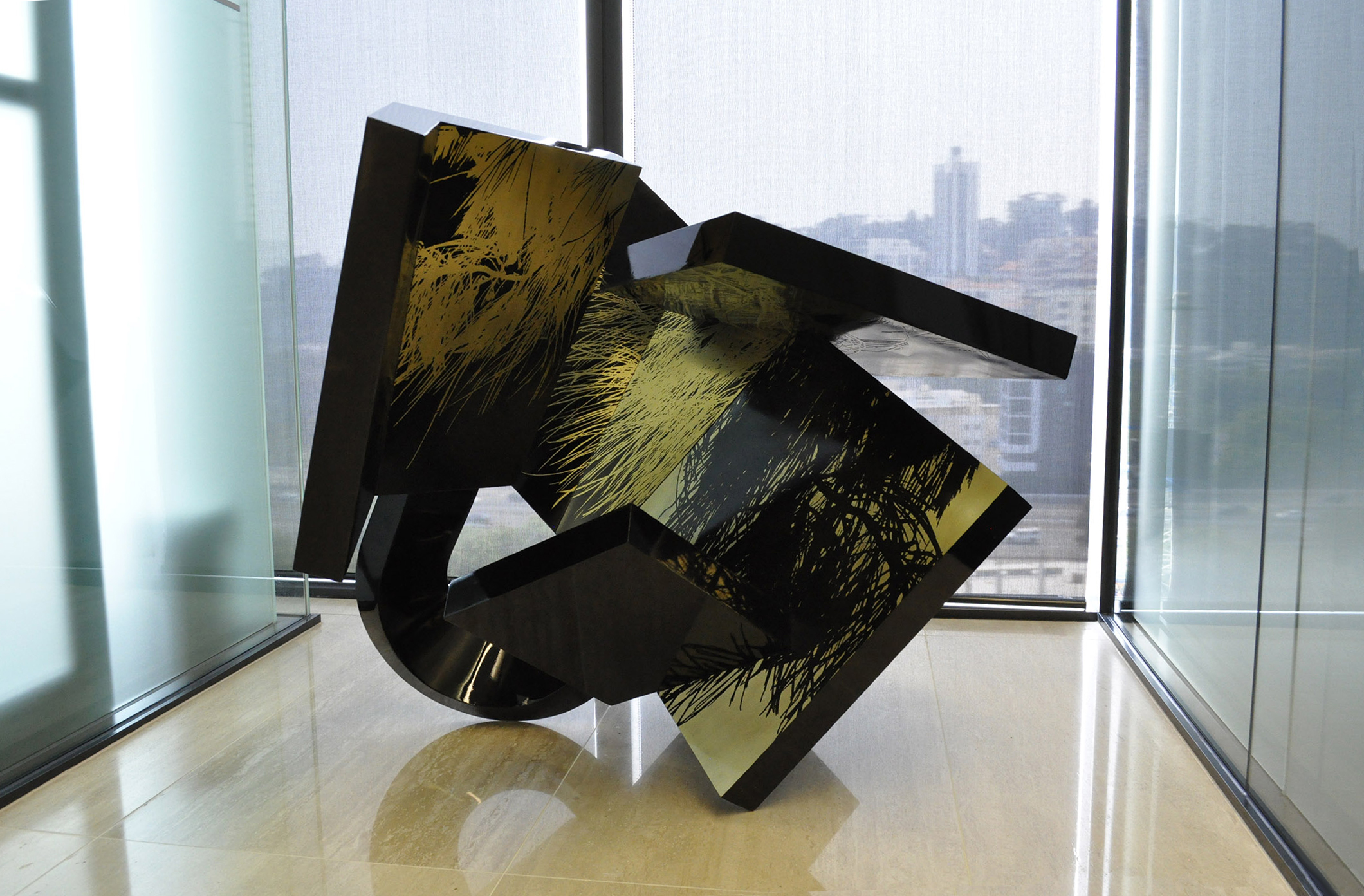
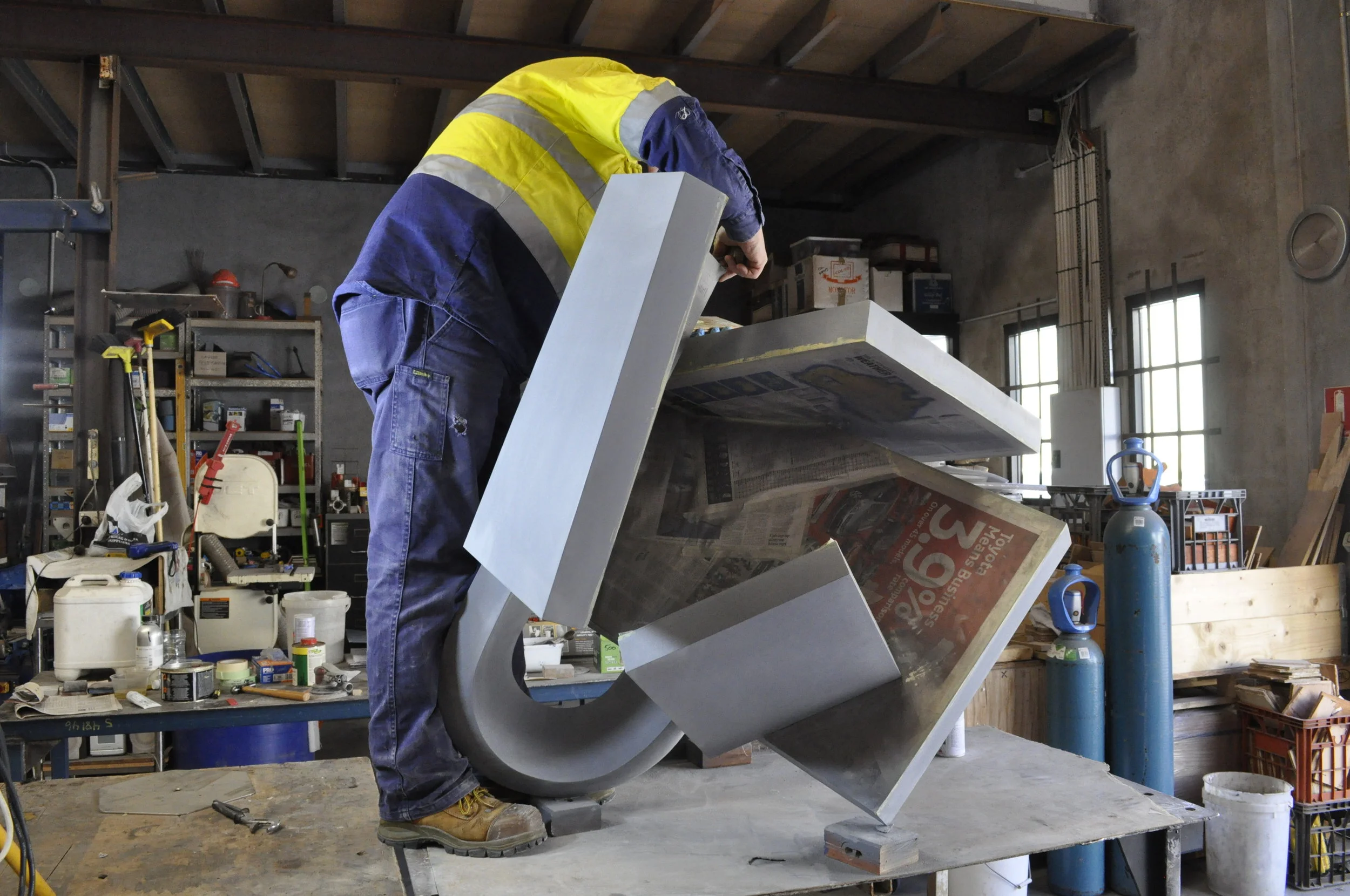
 This sculpture is also about contrast. It purposely plays refinement and detail against modernist primary form. It brings together solid simple cubic forms; black and heavy, these simple cubic and folded forms are arranged into a bundle with a disce
       
     
 The weight of the cubic form is contrasted with the refinement and beauty of inlaid brass, which is further etched with fine line-work. The brass turns the solid form into an illustrated page, with Australian foliage represented. It is reminiscent o
       
     
 The title   Peering Through   suggest something of the driver or idea for this work. This idea of looking through framed views to a space that is paradoxically both controlled and wild was a starting point for the work.


The title Peering Through suggest something of the driver or idea for this work. This idea of looking through framed views to a space that is paradoxically both controlled and wild was a starting point for the work.

DSC_6045.jpg
       
     
_DSC0686.JPG
       
     
 This sculpture is also about contrast. It purposely plays refinement and detail against modernist primary form. It brings together solid simple cubic forms; black and heavy, these simple cubic and folded forms are arranged into a bundle with a disce


This sculpture is also about contrast. It purposely plays refinement and detail against modernist primary form. It brings together solid simple cubic forms; black and heavy, these simple cubic and folded forms are arranged into a bundle with a discernible inner core; creating an inner space and an outer wall-like skin. It sets up an obscuring of the inner space. It is intended to be in some ways architectural with its flat planes supporting the play of sunlight and shadow and creating interesting relationships between planes.

 The weight of the cubic form is contrasted with the refinement and beauty of inlaid brass, which is further etched with fine line-work. The brass turns the solid form into an illustrated page, with Australian foliage represented. It is reminiscent o


The weight of the cubic form is contrasted with the refinement and beauty of inlaid brass, which is further etched with fine line-work. The brass turns the solid form into an illustrated page, with Australian foliage represented. It is reminiscent of the Japanese screens but quite different. The work takes the idea of black paint, and works it up into the refined combination of high gloss black void in which floats polished and sealed brass inlay. The introduction of figurative illustration and pattern is totally at odds with the modernist distribution of these forms.